Coronavirus infections in England appear to be falling, three weeks after the country was put into lockdown.
It’s welcome news, but one factor has made headlines: the number of infections do not appear to be falling anywhere near as fast as it did during the first lockdown of spring 2020.
The starkest findings were reported on Thursday in Imperial College London’s React study – which suggested the number of people infected with coronavirus in England is still at nearly its highest level since the end of the first wave in May, with one in 64 people infected.
“We’re not seeing the sharp drop in infections that happened under the first lockdown,” professor Paul Elliot, director of the study, said.
With schools and most shops closed, many will be asking why it appears, so far, to be taking longer to bring the rate down. We took a look at what scientists say could be behind it.
New variant
Experts across the board broadly lay the blame for the high infection figures at the door of the new variant of the virus, which is significantly more deadly and transmissible.
This was evidenced during the second lockdown, when figures for infection rates began rising again towards the end of November as the new strain began circulating.
Earlier this week, Professor Oliver Johnson, director of the institute of statistical science at the University of Bristol, told HuffPost UK: “In retrospect, knowing what we know now, that was probably a sort of smoking gun that something strange was happening, because numbers shouldn’t have been going up during lockdown.”
While existing vaccines are still expected to combat the new identified strains of the vaccine, Sir Jeremy Farrar, a member of the government’s Scientific Advisory Group for Emergencies (Sage), said on Thursday that new variants are “a warning of what is coming, which we must take incredibly seriously”.
He told the BBC’s Radio 4 Today programme: “In the future I think we will see variants that escape from the vaccines. The thing to do at the moment is to vaccinate as many people as we can in the world to drive down the amount of transmission and prevent these new variants coming.
“That’s in our national interests. It’s in an equitable and ethical interest, and it’s in the world’s interests to do so.”
More people are going to work
The React paper says the absence of a sharp decline as compared with the first lockdown may be explained in part by more people being allowed to physically attend their workplaces.
In spite of concerns over the surge in new variant cases, work in the construction and manufacturing industries has continued during recent months in all four nations of the UK.
The government has encouraged workers to travel in to sites if they cannot work at home, stating: “This is essential to keeping the country operating and supporting sectors and employers.”
Busy commutes and a lack of space on site make it difficult to keep people apart. Recent data released by the Office for National Statistics (ONS) revealed the workforce group with the highest number of deaths caused by coronavirus was men in manual labour, equivalent to 66.3 deaths deaths per 100,000 male workers in that sector, or 699 deaths in total.
More journeys being made
Remember the early government press conferences where we were given a daily update on how much transport everyone was using? Coloured lines showed us how many journeys were being made by car, train and bus compared to a “normal” week at that time of year – and the figures were reassuringly low for the most part.
We don’t get those slides any more, but the Department for Transport does still release the data – it just needs crunching to produce the charts.
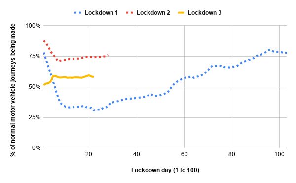
HuffPost UK analysis found that the three national lockdowns have seen very different levels of transport use.
During lockdown 1 from late March, the number of journeys by car and other motor vehicles fell significantly. Just over three weeks in, motor vehicle use had dropped to 31% of what it would be during a “normal” year using a rolling seven-day average. But just over three weeks in to lockdown 3, motor vehicle use is at 58% using the same calculation. Interestingly, vehicle use fell even less during the short-lived lockdown 2.

We saw the same trend when it came to National Rail and London Underground use – the Tube was a low as 4% or 5% by this point in lockdown 1, but remains stubbornly at 13 to 14% this time round. In all cases, lockdown 1 was the quietest compared to a “normal” year, with lockdown 3 faring less well and lockdown 2 having seen worse compliance still.
Schools
Though Public Health England (PHE) has said that transmission of Covid-19 in primary schools is “extremely low”, it is estimated that there are more children attending at present than there were during the first lockdown.
Approximately 813,000 children of critical workers were in attendance on January 21, accounting for an overall proportion of 14% pupils in class, according to figures from the Department for Education (DfE).
During the first lockdown, schools were attended by a very small number of eligible children. In-person class attendance has risen since the government expanded the criteria for children to attend.
The government’s own data shows school attendance as of January 13 was 21% in state-funded primary schools, 5% in state-funded secondary schools and 30% in state-funded special schools.
Between March and May 2020, those figures were 4% in state-funded primaries, 1% in state-funded secondaries and 8% in state-funded special schools.
Public health experts argue that teachers must be vaccinated before a wider reopening of schools is sanctioned, though this would not and does not prevent pupils from transmitting the virus, potentially between households.
Johnson has announced that schools will not reopen immediately after February half-term, though he hopes they will begin to reopen from March 8, if the target of vaccinating the four most vulnerable groups with a first dose by mid-February is achieved.
The three-week gap before reopening schools is to allow those who have been vaccinated to develop immunity.
The East Midlands question
Steven Riley, professor of Infectious Disease Dynamics, points out that the React paper backs up previous government findings that suggest larger households carry a higher risk of infections than smaller ones, but says the research does not explain why this differs between regions.
He said: “In our data we have a reasonably robust result that there appears to be a trend of increasing infections in the East Midlands and that’s the limit of what we can actually say.
“The number of people going for tests in the East Midlands who are positive has been increasing during the period of this study. We have listed a number of possible features. We are not saying we have direct evidence of one explanation over another. We need to get across the ‘what’ before we can speculate as to the ‘why’.”
A review of household Covid transmission by Sage published last month echoed this, finding that the virus being passed around within people’s homes was a significant contributor to its overall spread in the UK.
The consensus statement dated November 24 analyses data from five population studies – ONS, REACT-Imperial, Biobank, QResearch and OpenSAFELY.
The studies found that the presence of multiple generations within single households is a key factor in the risk of Covid-19 infection and death, even taking into account deprivation and other factors those households also experience.
Scientists have found the risk is particularly significant within households in south Asian communities, which tend to be larger and multigenerational and which are particularly prevalent in the East Midlands region.
But none of these factors is new since the first lockdown.
Differences in data
The findings of the React study differ from government test and trace figures, which have shown a steady decline in numbers since January 4.
The React study found 1.57% of all people in England had Covid at some point between January 6 and January 22. An earlier version of the study, which cut off a week earlier and measured January 6 to January 15, found there could even be “a potential uptick” in infections towards the end of that period, while both versions used the word “plateauing”, saying infections were the highest they had ever been.
Yet the government’s own coronavirus dashboard has been showing a steady decline in cases for weeks: as of January 21, the seven-day average was 31,640 cases a day, down from 61,231 at the start of the year. It’s important to note that even the latest figure is still a huge number compared with the numbers well under 1,000 that we saw during the summer.
Steven Riley, professor of Infectious Disease Dynamics, told HuffPost UK: “There is no single data source that is absolutely correct; the ways of looking at the infections in the community are all quite different. Test and trace case numbers are a function of who goes to get tested and the proportion of those who are positive when they go.”
But he suggested the React figures may give a truer picture. “If [people] become less likely to get tested for some reason, then that will reduce the numbers [on Test and Trace] even though the number of people who are infected or infectious isn’t necessarily coming down as quickly.”
By contrast, the React study swabs a group of people regardless of whether they have symptoms, which picks up asymptomatic infections as well as symptomatic cases.
“We are getting people, regardless of whether they want to be tested or not, who are just participating in a survey. They’re not going because they have symptoms,” said Riley.
The main findings from the eighth round of the study estimated the national R number to be at 0.98 with a range of 0.92 to 1.04. That too is a little higher than Sage and the DHSC’s own estimate of 0.8 to 1.0.
Regional prevalence was highest in London at 2.83%, while in the south-west it was 0.87%.
Prevalence increased nationally in all adult age groups and was highest in 18 to 24-year-olds at 2.44%, while prevalence in the over-65s is 0.93% – almost one in 100.